Note: The GoReport Creator tool has a drag-and-drop interface that enables you to easily add sections to your report and move sections into the position of your choice.
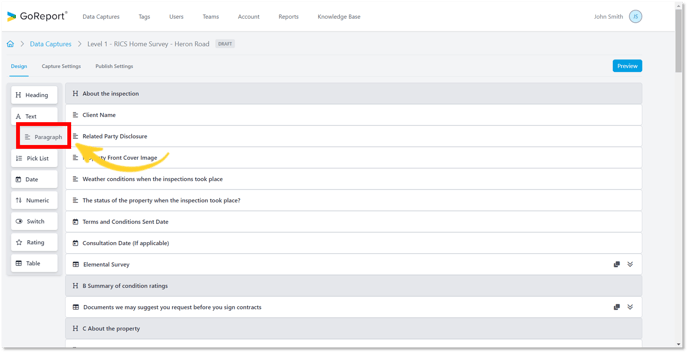
- In the Design tab, drag and drop or click on Paragraph to bring this field to the centre of the screen.
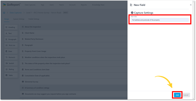
- Choose a title and click Add.
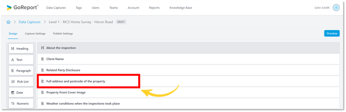
- The Item Title has been updated.
Tip: The data capture autosaves every change made in real time.
- Click on the item to edit the settings.
Capture Settings
- The Item Title can be changed at any stage before making the template live.
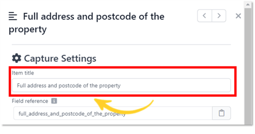
- A Field reference for each item is created automatically after you choose the Item Title.
Tip: The Field reference cannot be changed or updated. If you wish to change the reference name, you will need to delete the item and create a new one.
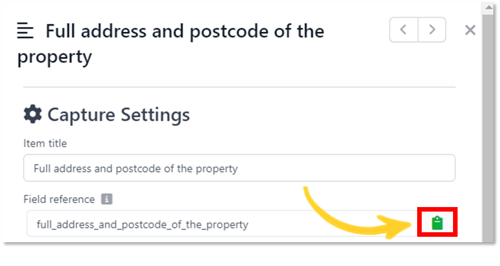
- Field references can be copied using the clipboard icon (as shown below).
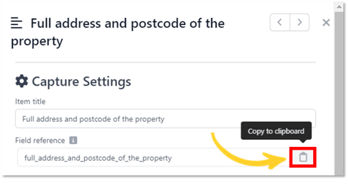
- The clipboard will change colour when it has been copied. This reference is then stored in the Reference Library under Publish Settings for future use.
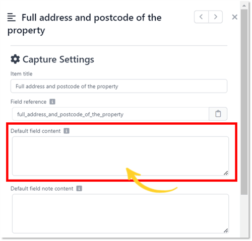
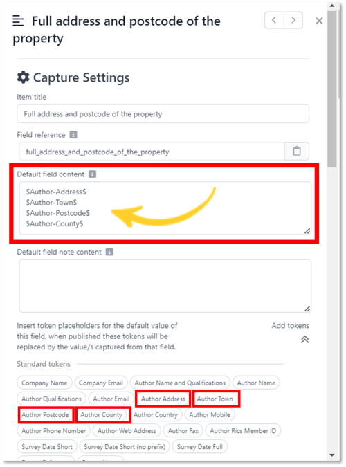
- Default Field Content - Information in this field will be shown in the published data capture.
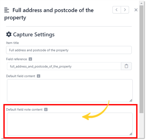
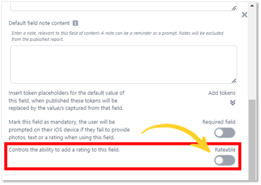
- Default Note Content - Enter a note, relevant to this field of content. A note can be a reminder or a prompt. This note will be excluded from the published report.
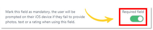
- To make this Paragraph item a required field during data capture, use the Required Field toggle button.
A “Token” is a placeholder for data capture. You can use the "Standards tokens" in the data capture or use "Field tokens".
- Click on the arrows to expand the token list.
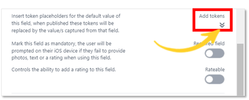
- Standard tokens are taken from the report, for example: Author Name.
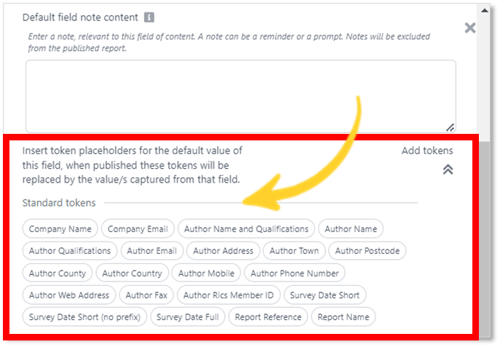
- Select one or more token(s) to include in the field.
- Click on the Rateable toggle button to display the Ratings.
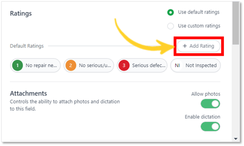
Ratings
Default Ratings: These can be set up through the Capture Settings page and can be used in any rateable field.
Custom Ratings: Ratings that are created for this specific field and can only be added through this area.
- Default Ratings and Custom Ratings are created in the same way.
- Select Use default ratings or Use custom ratings.
- To add a rating, click on Add Rating (as shown below).
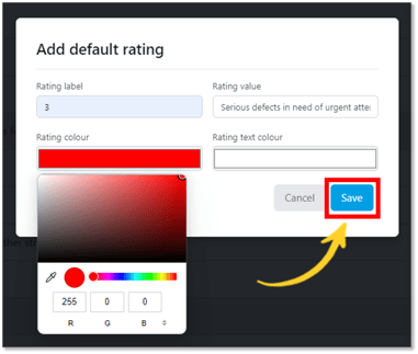
The Rating label, colour and value can be customised to your preferences.
Tip: The rating label field is limited to two characters.
- You can choose the colour for the Rating and the text by using the colour selector.
- Click Save.
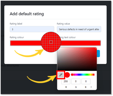
Tip: If you do not want to see the Rating Label on the icon, simply copy the RGB numbers from the Rating Colour selector to the Rating Text Colour selector as shown below.
Tip: Default ratings and custom ratings cannot be used together for the same field.
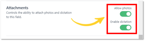
Attachments
- Attach photos and dictation to this field by using the toggle buttons.
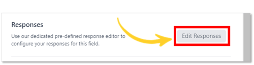
- Click Edit Responses to Add or Edit responses for this data capture. Further information on using responses can be found in this article:
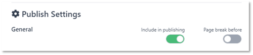
Publish Settings
- General - By using the toggle buttons, you can select whether to include this item in the published data capture and whether a page break should be included directly after.
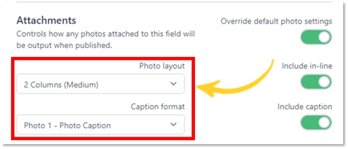
Attachments – This allows you to control the photo layout and caption format. Click on the toggle button below to view the publishing options.
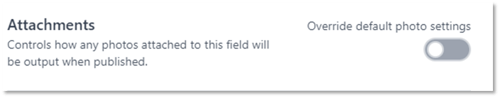
- Using the drop-down menus, select the preferred photo layout and caption format.
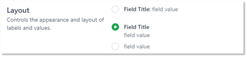
- Layout - You can choose to have the Field Title and Field Value on the same line, or to have the Field Value below the Field Title or display the Field Value on its own.
Tip: When you click on an Item from the Design screen, it will automatically be placed at the bottom of your data capture list.